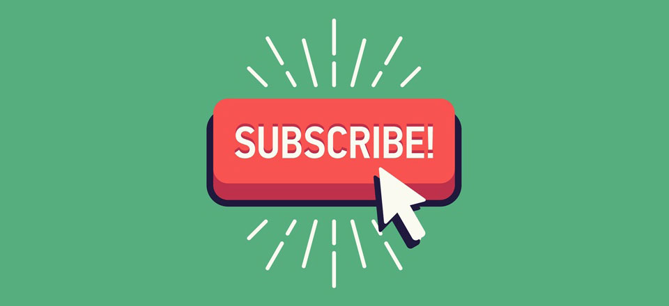
It is not uncommon to see subscribe buttons more frequently these days. These buttons can be seen on practically all sites. Available in varied shapes and colors, developers must focus on creating one that is irresistible and incredibly convertible.
Here are the keys to developing an irresistible subscribe button:
The A/B Testing
It facilitates you to observe how well the subscribe form is performing. Keep illustrative results while testing. You can get precise results through short A/B testing-periods. It functions similar to surveys. For better results, make more people in the test.
Color Matters
Color choice is important. You must do something to make the subscribe button stand out. Target audience will have an emotional response to different colors. So understand this emotional response is and see if it is relevant to your content, services/products offered. Avoid adding a color that simply fails to appeal to people emotionally. Listed below are some colors and their impulsive association:
Pink – Youthful & Feminine
Black – Powerful & Bold
Orange – Warmth & Passion
Red – Energy & Urgency
Purple – Calm & Serious
Blue – Trust & Security
Green – Wealthy & Environmental
Yellow – Optimistic & Creative
In short, a standard ‘appropriate’ color for subscribing button does not exist. It all depends on the emotion you wish to trigger with them. Play with it!
The First Person Tactic
The first person speech will make your speech attractive and add a personal touch to it. This means if you use ‘get FREE stuff in your inbox’, simply switch to ‘Yes, I want FREE stuff in my inbox’. When you use first person, you actually stimulate the visitor’s thought process. They will start wondering how they will get benefitted from the content.
Tactical Location on Website
It is very important that you look for a strategic position for subscribe button on your website. Make sure the placement is always within the context. Avoid places these randomly. You may include these after sharing some relevant content within your blog post. This increases the probability of visitors looking forward to additional content on mail after going through the entire piece of content. For more info visit here: freelancewebdeveloper.net
Urgency of Time
This is one of the most important things that will help you come up with a ‘result oriented’ subscribe button. No one likes to miss out on good things, especially when they come free! So when you create a sense of urgency, it will boost conversions the subscribe form delivers. For instance, you may give something that offers a sneak peek to visitors of what’s heading next. This may be some free content, update, offer that they receive on mail. When you give visitors a sense of time urgency to subscribe, the efforts also get targeted towards convincing them.
The Design
When it comes to design, ‘Less Is More’ is the rule most expert designers follow. A minimalistic design is what helps the most. Overwhelming your visitors is not needed. This will only confuse and distract them. So stick to a clean and simple design that emphasizes on the core value of subscribing. Be confident of the value you wish to bring. Your visitors will appreciate it and they will act accordingly.
To Sum Up
It is important to focus on creating a subscribe button that functions well than one that’s just visually appealing. There are a number of psychological aspects that play an important role. The tips mentioned above involve aspects of a subscribe button; namely the purpose and appearance.